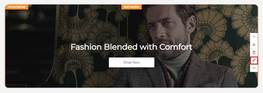
Home Banner
The Home Banner is the first and most crucial element visitors see on your website, making a powerful first impression. Choose from various types like images, sliders, videos, carousels, and more, each with extensive customization options for colors, fonts, styles, animations, and hover effects.
How to edit Banner?
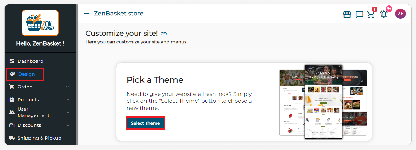
- Navigate to the dashboard and select the Design module.
-
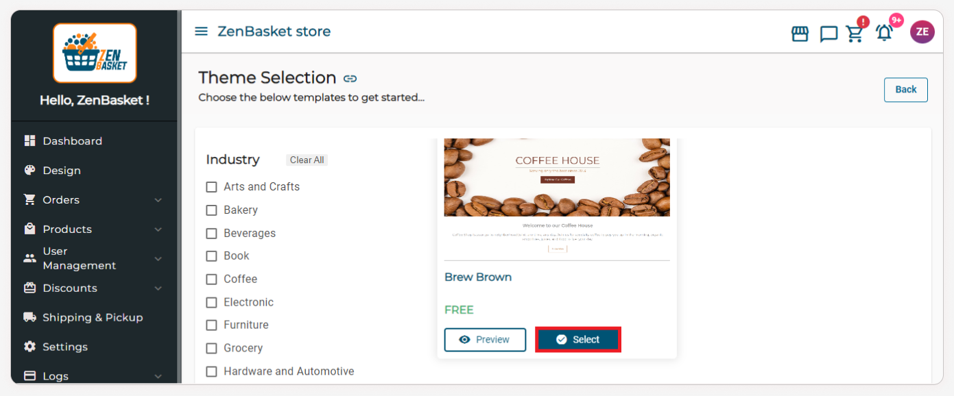
In the Pick a Theme section, click the Select Theme button.
-
Choose your desired theme and click the Select button.
-
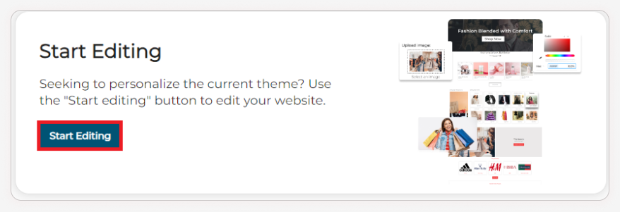
Next, in the Start Editing section, click the ‘Start Editing’ button.
-
To edit the selection, click the edit icon from the tools.
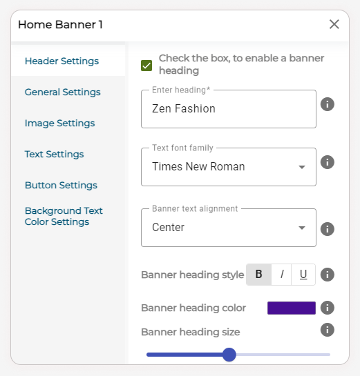
Header Settings
Check the box, to enable a banner heading.
| Title | Description |
|---|---|
| Heading | Enter the heading for the Home Banner (Eg.: Zen Fashion). |
| Text font family | Choose the text font family from the dropdown. |
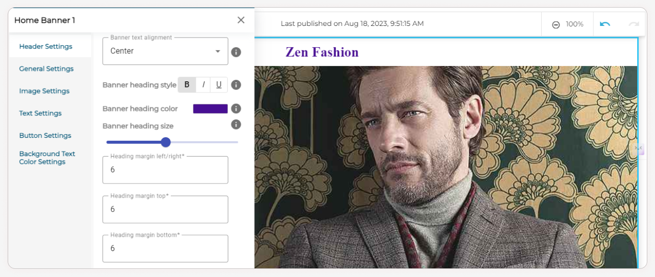
| Banner text alignment | Choose the text alignment as Left, right, or center. |
| Banner heading style | Select the Banner heading style as Bold, Italic or Underlined. |
| Banner heading color | Set the Banner heading color from the color palettes. |
| Banner heading size | Use the slider to resize the banner heading. |
| Heading margin | Enter the values for Heading margins: Left/right, top and bottom. |
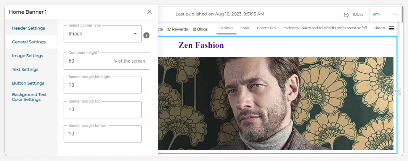
General Settings
- Choose the banner type from the dropdown as Image, Slider, Video, Carousel, etc.
- Enter Container height which utilizes the given percentage of the screen, and Banner margins as left/right, top and bottom. (Only for Image, Slider, Video, Carousel, Solid color, Gradient, and Digital Product banner type).
Now, Go to the next section.
For Image and Slider Settings
| Title | Description |
|---|---|
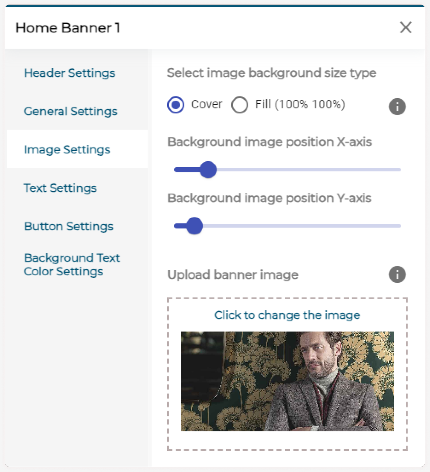
| Background size type | Select the image background size type as Cover or Fill. |
| Cover: Image is applied to that particular dimension. (Some areas may be cut). Images don’t adjust themselves to fit. | |
| Fill: Images fit in the banner space. (Image will be stretched). | |
| Background image position | Use the slider to modify the image position on the X-axis and Y-axis. |
| Adjusting this will provide responsiveness to the banner image both for mobile and desktop. | |
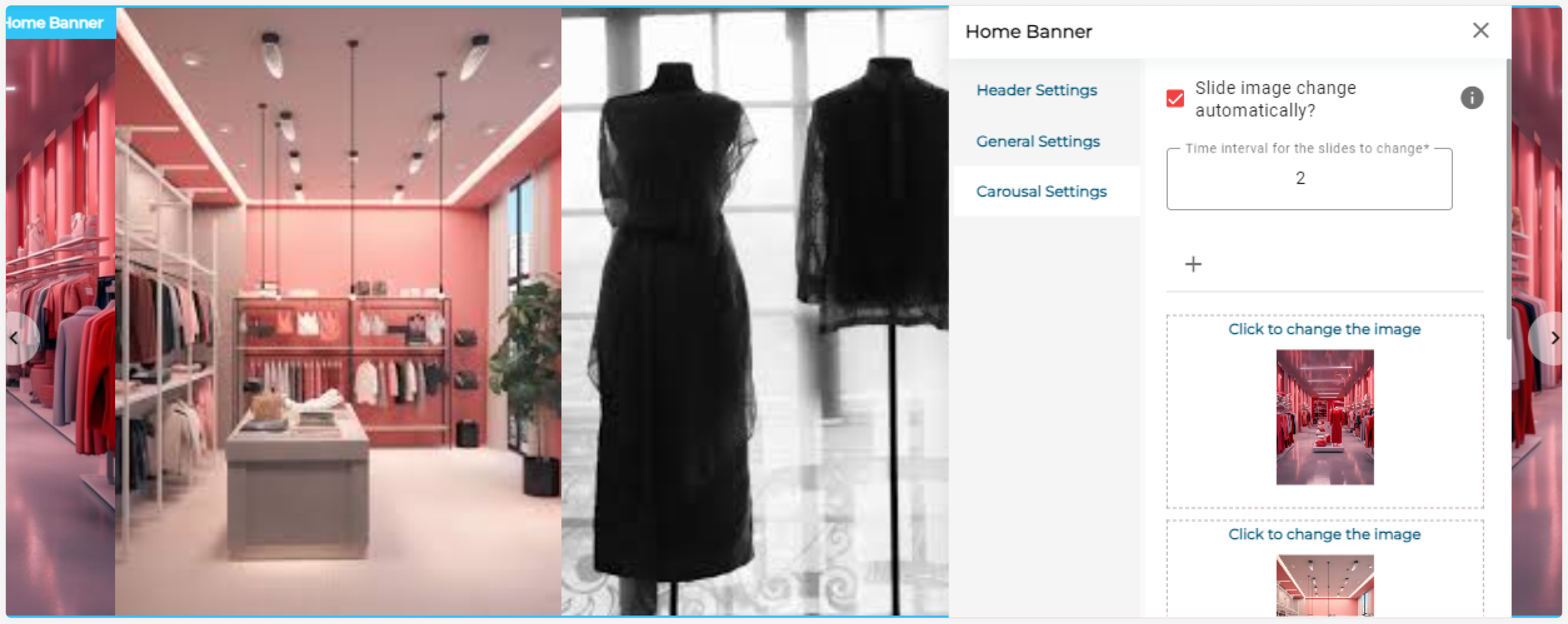
| Checkbox and Time interval | Check the “Slide image change automatically” checkbox to change slides between the given time intervals automatically. |
| Uncheck the checkbox to manually change the slide. | |
| Enter the Time interval for the slides to change. | |
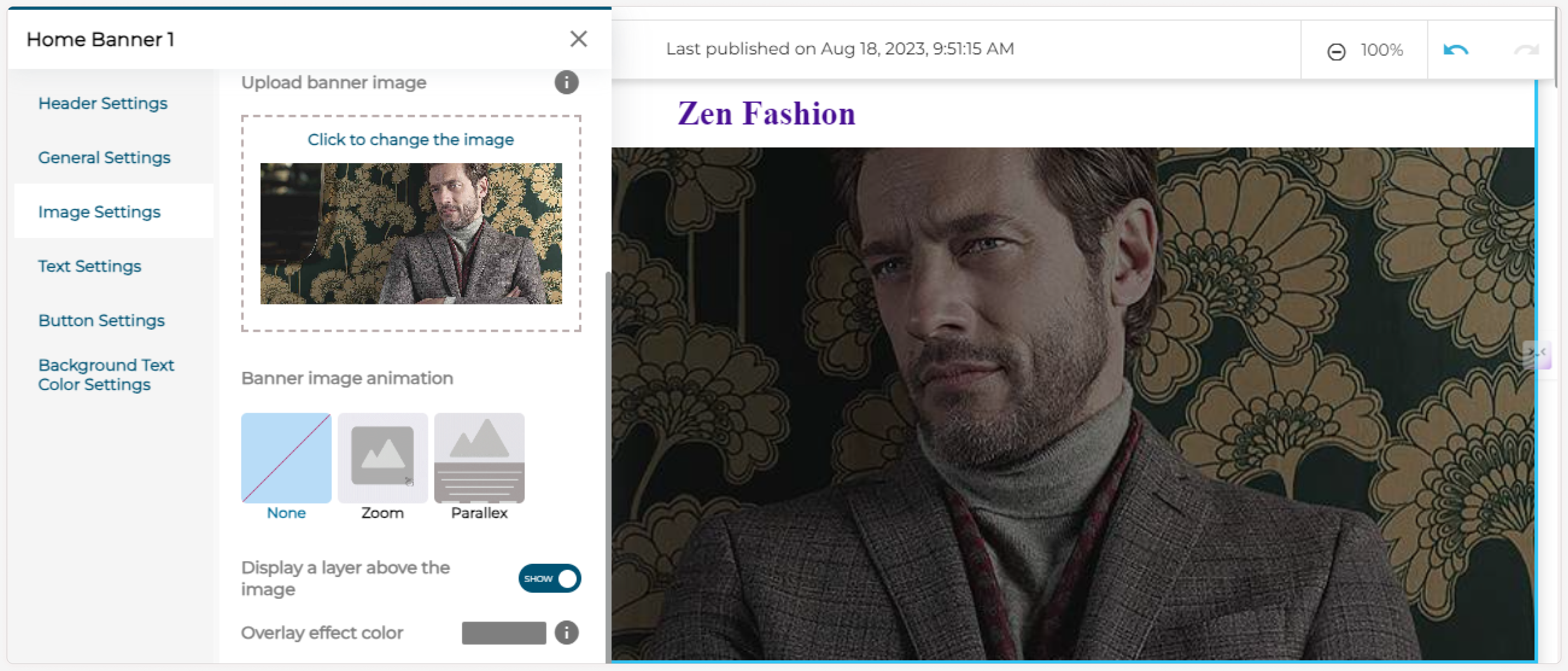
| Upload image | Upload the banner image from your device or ZenBasket gallery. |
| Dimensions for banner image: | |
| 1920 x 1080 (Full HD) | |
| 1280 x 720 (HD) | |
| 854 x 480 (480p) | |
| 640 x 360 (360p) | |
| 426 x 240 (240p) | |
| Banner image animation | Select the banner image animation as None, Zoom, or Parallax after uploading a banner image. |
| Hide/Show | If you want to display a layer above the image, enable the toggle. |
| Overlay effect color | Set the Overlay effect color from the color palettes (only if you’ve enabled the display layer toggle). |
Note:
- If you choose Fill as the image background size type, then the background image position can’t be modified.
- The checkbox and time interval section display only for slider and carousel banner type.
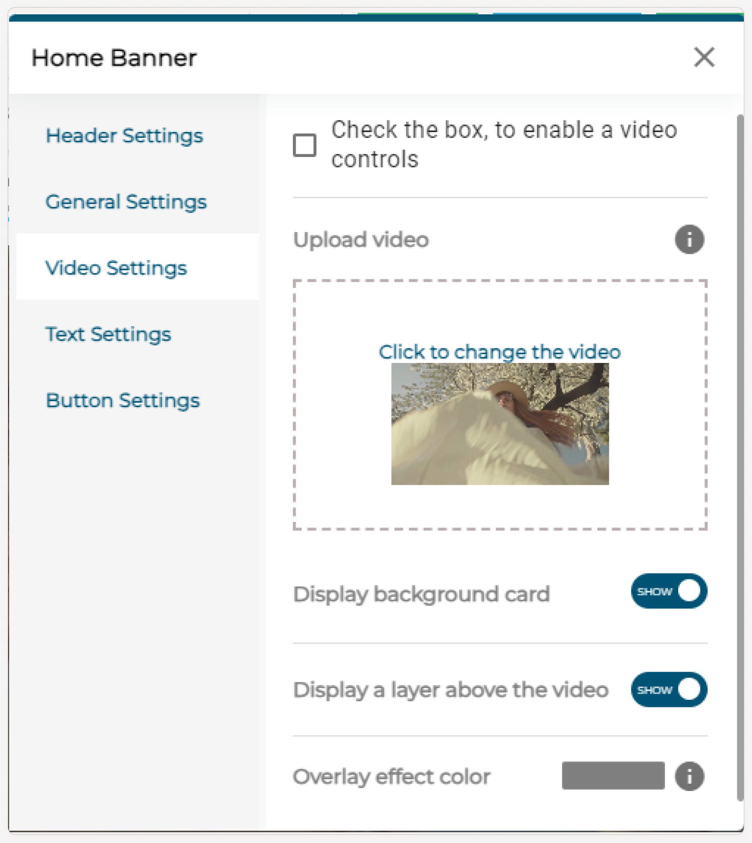
For Video Settings:
- Check the box to enable video controls. Upload a video.
- Enable the Display background card toggle and Display a layer above the video toggle if necessary.
-
Choose the Overlay effect color using the color palette.
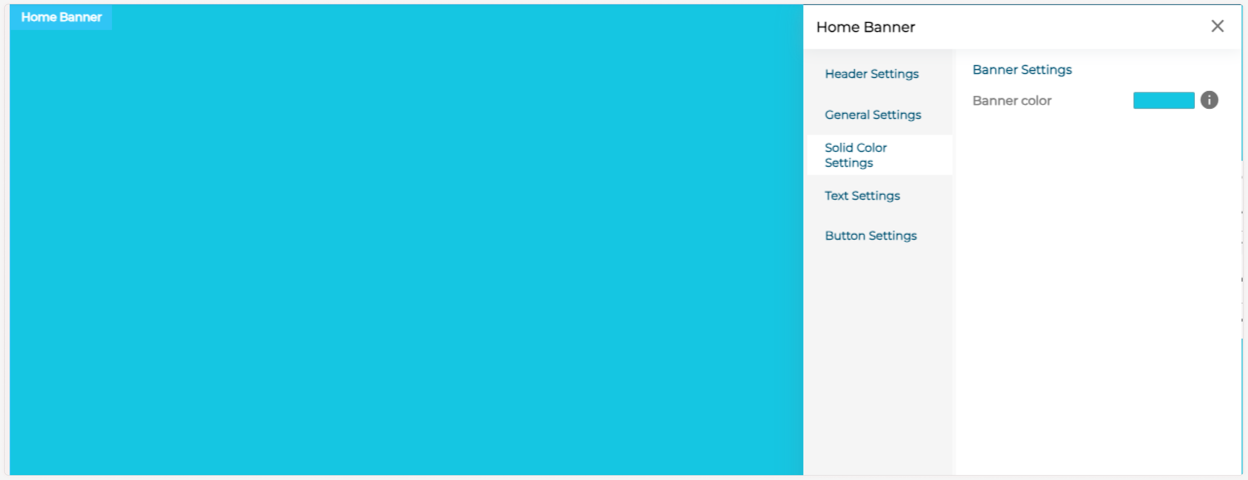
For Solid Color Settings
Select a color from the color palette shown for the banner.
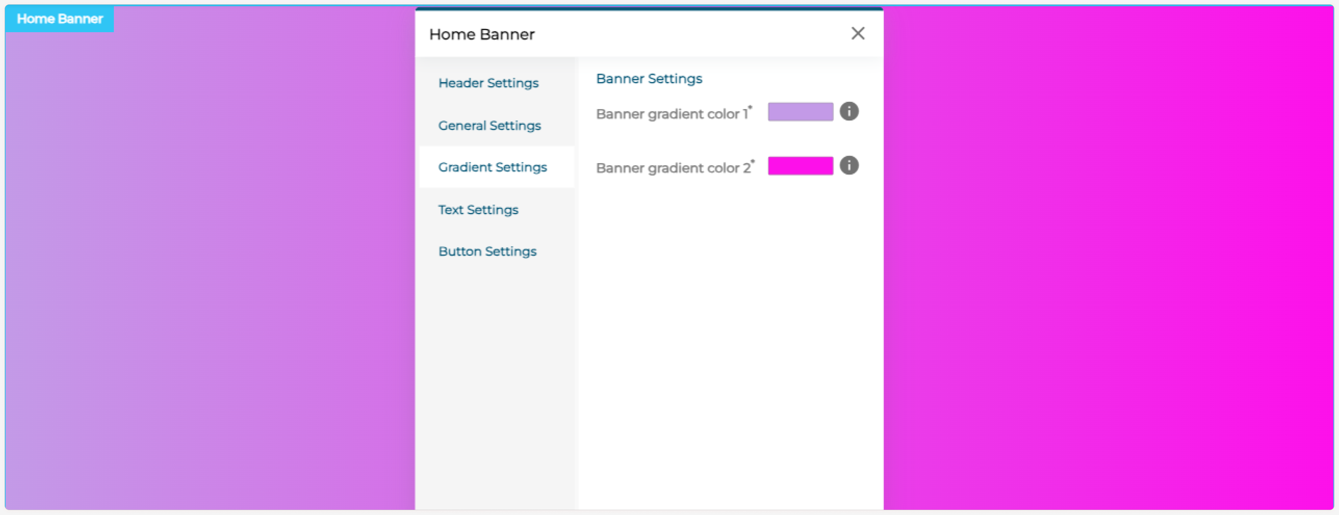
For Gradient Settings:
Select two colors from the color palette shown.
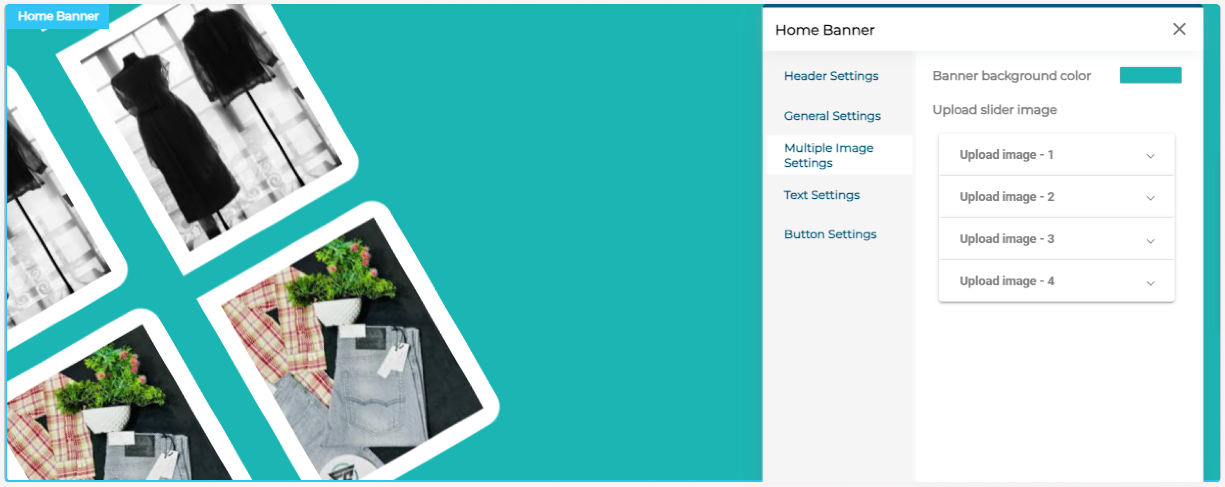
For Digital Product - Multiple Image Settings:
Set the banner background color and upload 4 slider images.
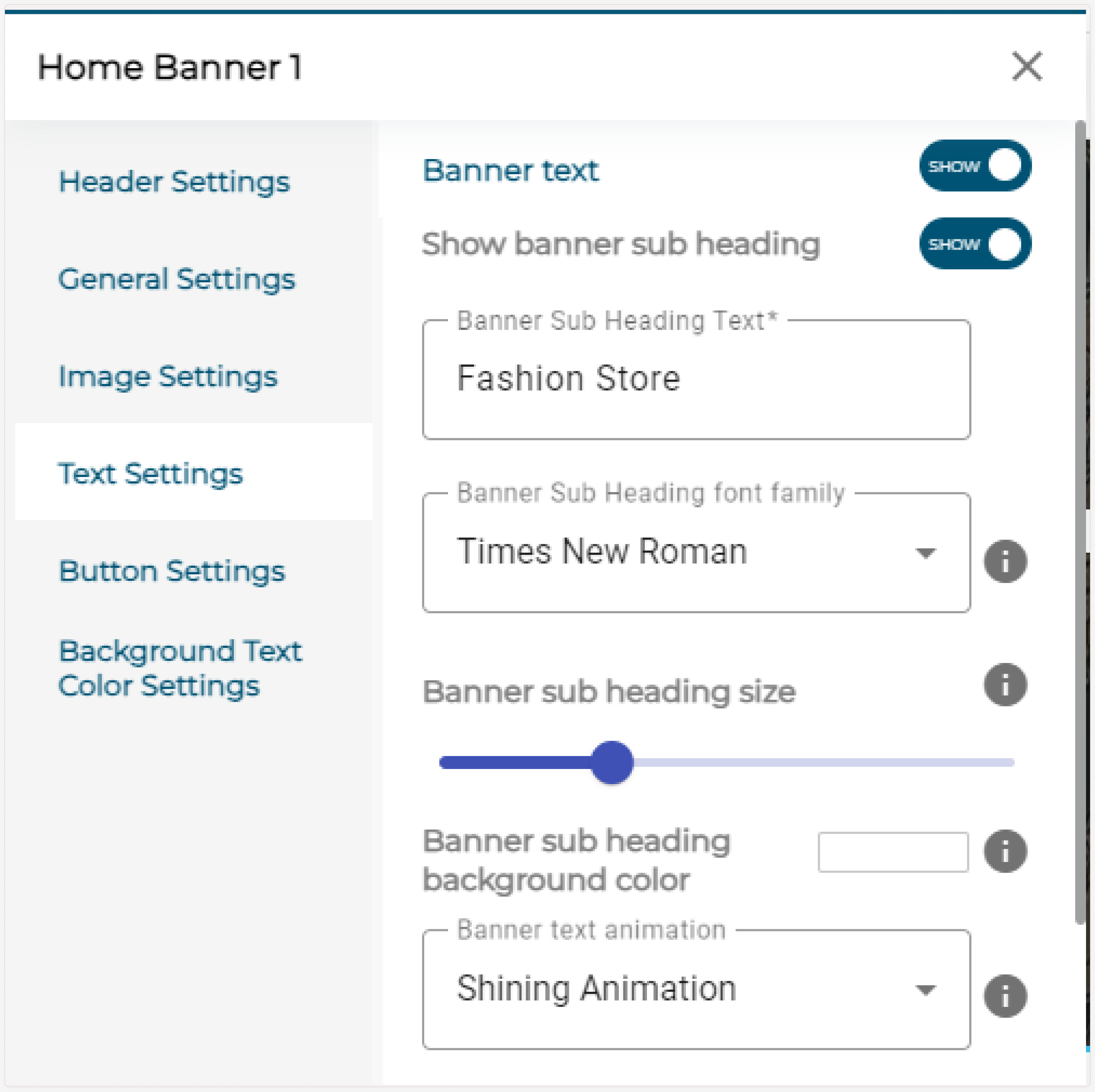
Text Settings
Enable the toggle to show banner text.
| Title | Description |
|---|---|
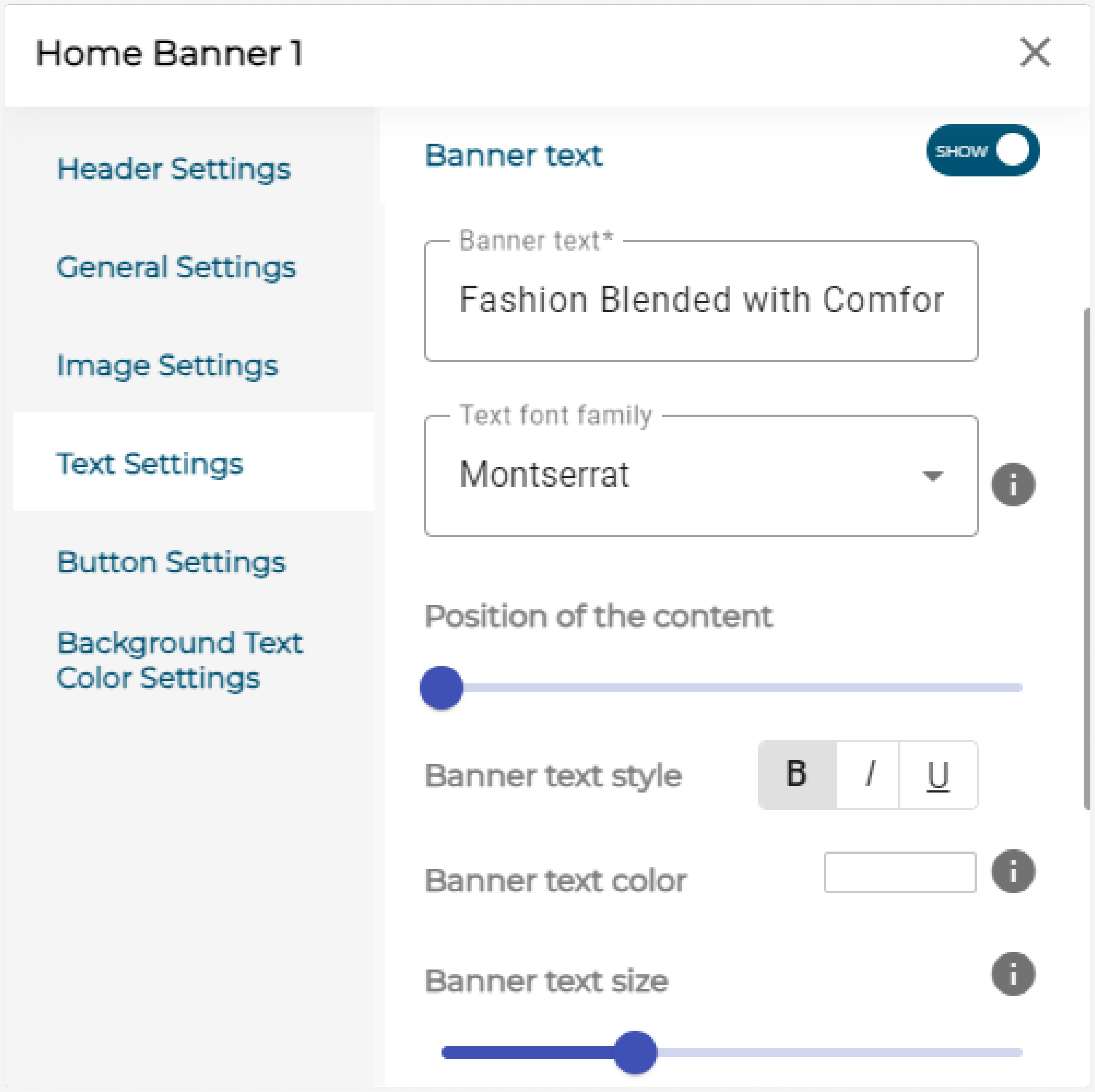
| Banner text animation | Choose the banner text animation from the dropdown as Flicker, Shining, etc. |
| Banner text alignment | Choose the text alignment as Left, right or center, etc. |
| Banner text | Enter the banner text. (Eg.: Fashion Blended with Comfort) |
| Text font family | Choose the text font family from the dropdown. |
| Position of content | Use the slider to set the position of the content. |
| Banner text style | Select Banner text style as Bold, Italic or Underlined. |
| Banner text color | Set the Banner text color using the color palettes. |
| Banner text size | Use the slider to resize the Banner text. |
| Banner subtext | Enter the banner subtext. (Eg.: Shop now) |
| Subtext font family | Choose the subtext font family from the dropdown. |
| Banner subtext style | Select Banner subtext style as Bold, Italic or Underlined. |
| Banner subtext color | Set the Banner subtext color using the color palettes. |
| Banner subtext size | Use the slider to resize the Banner subtext. |
| Hide/Show | Enable the toggle if you want any divider between text and subtext. |
| Divider Width | Use the slider to resize the Divider Width. |
| Divider Thickness | Use the slider to resize the Divider Thickness. |
| Divider Color | Set the Banner Divider color using the color palettes. |
Now, enable the banner subheading toggle and enter the banner subheading text, choose the banner subheading font family from the dropdown and use the slider to change the subheading size. Choose the background color from the color palettes. (Only for Image and Slider banner type)
Button Settings
Enable the button settings toggle to customize the button details.
| Title | Description |
|---|---|
| Banner button layout | Choose the banner button layout from the given layouts: Row or Column (This change is reflected when you add more than one button). |
| Button alignment info content | This modifies the position of the button. |
| Button text | Enter the button text. |
| Button text font family | Choose the Button text font family from the dropdown. |
| Button text style | Select Button text style as Bold, Italic or Underlined. |
| Button text alignment | Choose the button text alignment as left, center or right. |
| Redirect to | Choose the redirect page while clicking the button. |
| Button text color | Set the Button text color from the color palettes. |
| Button color | Set the Button color from the color palettes. |
| Button border radius | Use the slider to resize the button border radius. |
| Button type | Choose the button background size from the displayed button type: Flat, Raised, Stroked, Normal. |
| Hide/Show | Enable the toggle to show an icon along with the button text. |
| Button icon | Enter the button icon name from the Mat icon list. |
| Icon position | Select the icon position as left or right to be placed corresponding to the button text. |
| Button icon color | Set the button icon color using the color palettes. |
| Button text icon alignment | Select the icon text alignment as left, right, center or justify, which correlates with the button text. |
| Hide/Show | Enable the toggle to show hover animations to the button. |
| Hover animations | Select animation from the given list. |
| Button hover text color | Set the text color which is shown after hover animation. |
| Button hover color | Set the hover color which is shown after hover animation. |

Background Text Color Settings
Enable the banner text background toggle to add a background for the banner text.
| Title | Description |
|---|---|
| Banner text background color | Choose your banner text background color from the displayed color palettes. |
| Space between text and subtext | Use the slider to change the space between text and subtext. |
| Space between subtext and button | Use the slider to change the space between subtext and button. |
| Banner text’s background width | Use the slider to choose the background’s width for the banner text. |
| Space between content and box | Use the slider to change the space between content and background box. |
| Border radius | Use the slider to change the radius of the border. (corner curvature) |
Note:
-
- Do the same for all the slider images if you choose the Slider banner type. Background Text color Settings are not available for Video, Solid color, Gradient, and Digital Product banner types.
For Carousel Banner Type
- Check the Slide image change automatically checkbox to change slides between the given time intervals automatically.
- Uncheck the checkbox to allow your customers to manually change the slides.
- Enter the Time interval for the slides to change.
-
Upload multiple images for carousel banner type. (A minimum of three images is mandatory).