Carousel Element
Introduction
The Carousel element is a rotating banner component that allows you to display multiple slides within a single section.
It is commonly used on ecommerce websites to showcase promotions, highlight products, or display key messages on the homepage and landing pages.
Use this guide to learn how to edit, manage, and customize slides inside the Carousel elements in ZenBasket Builder.
In the ZenBasket Builder, you can use two types of carousel elements.
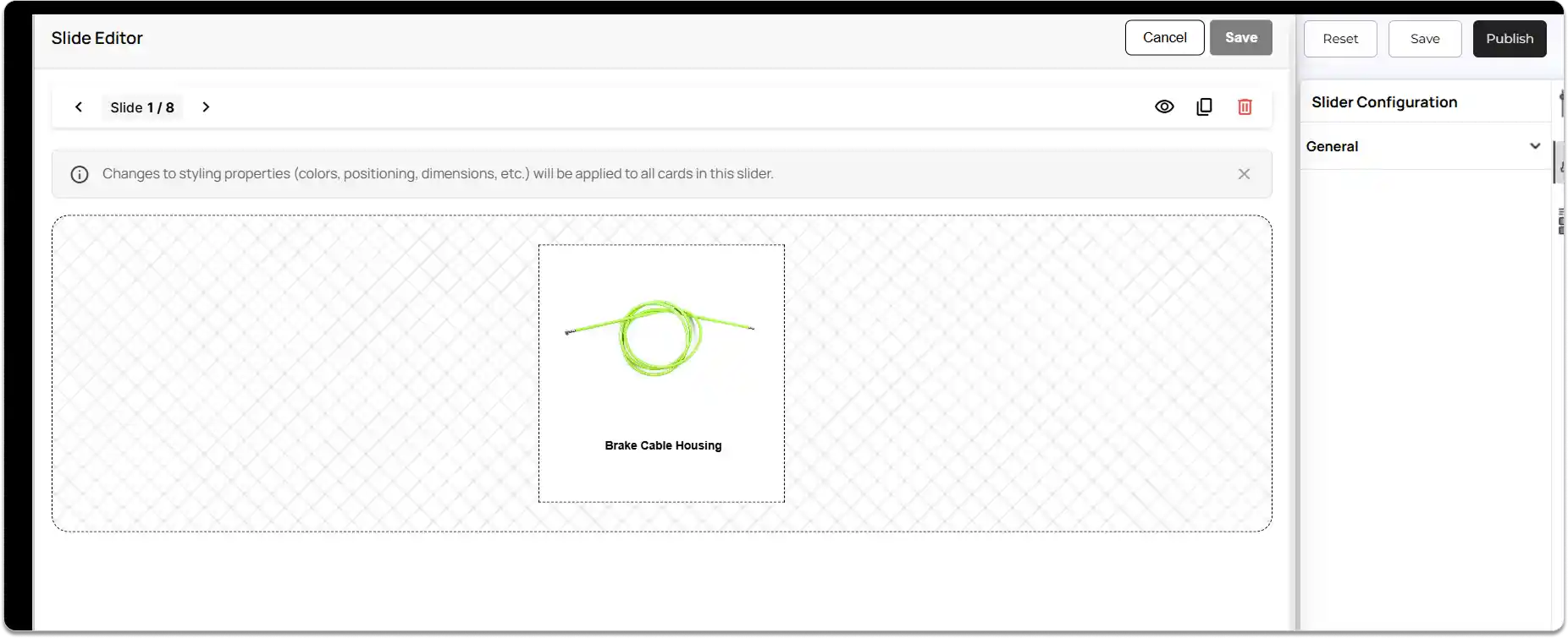
The first type lets you edit each slide individually, while the second type applies changes to all slides at once and only allows content changes.
Now let’s see the first type - Individual Content Rotator, where each slide can be edited individually, and changes affect only that specific slide.
Types of Carousels
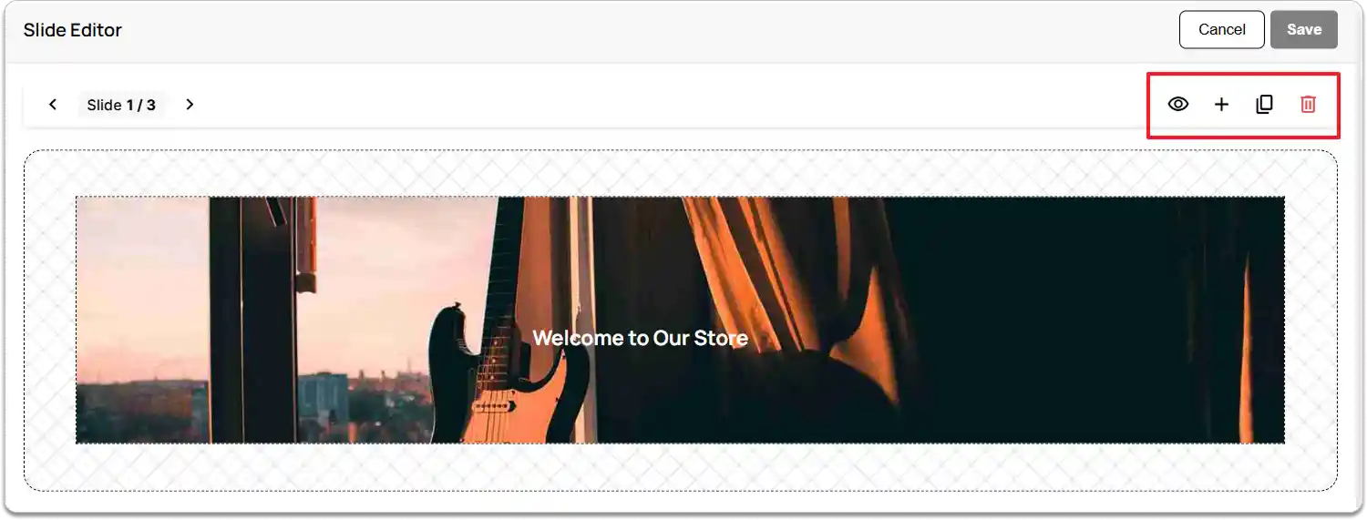
Individual Content Rotator
Slide-Editor Actions
-
Hide Slide: Click the Eye icon to temporarily hide a slide from the storefront. The slide remains in the editor for future use.
-
Add New Slide: Click the Add icon to create a new blank slide that you can design from scratch.
-
Duplicate Slide: Click the Duplicate icon to create an exact copy of the selected slide. This is useful for maintaining consistent layouts or creating quick variations.
-
Delete Slide: Click the Delete icon to permanently remove the slide from the carousel.
-
Click Save to apply your changes or Cancel to discard them.
The second type of Carousel is the Unified Content Rotator, where any styling changes are applied to all slides at once, and only the content inside each slide can be edited individually.
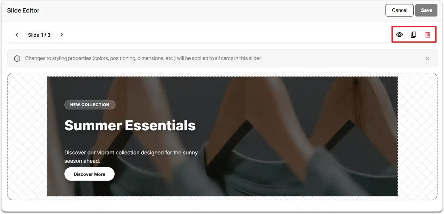
Unified Content Rotator
Slide-Editor Actions
-
Hide Slide: Click the Eye icon to temporarily hide a slide from the storefront. The slide remains in the editor for future use. Hiding an element inside one slide will hide the same element across all slides.
-
Duplicate Slide: Click the Duplicate icon to create an exact copy of the selected slide. This is useful for maintaining consistent layouts or creating quick variations.
-
Delete Slide: Click the Delete icon to permanently remove the slide from the carousel. If you delete any element inside one slide, the deletion will be reflected across all slides.
-
Click Save to apply your changes or Cancel to discard them.
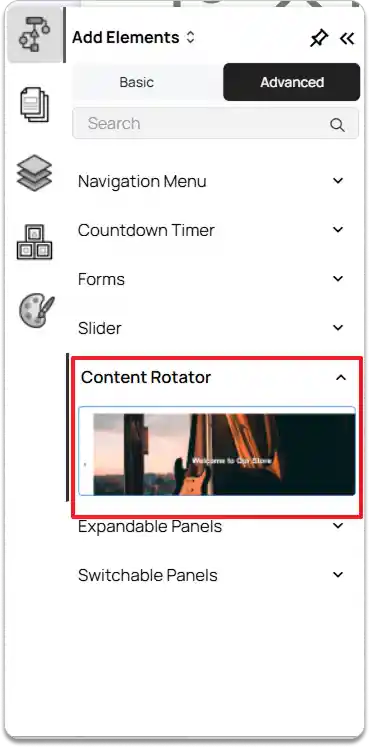
How to Add a Content Rotator Element
-
Go to the Left Tools Panel and click Add Elements.
-
Under Advanced Elements, scroll down or search for the Content Rotator element.
-
Drag and drop the desired Content Rotator into your desired section or layout area.
-
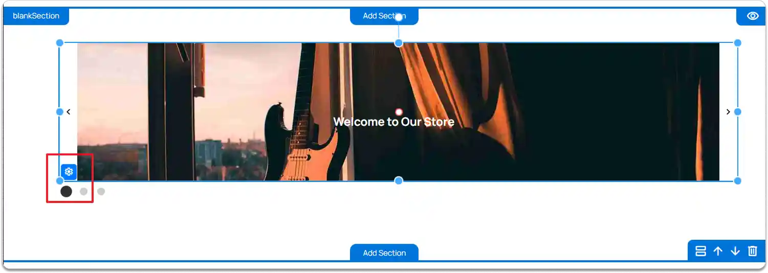
Adjust the slider’s position and size using the drag handles as needed.
-
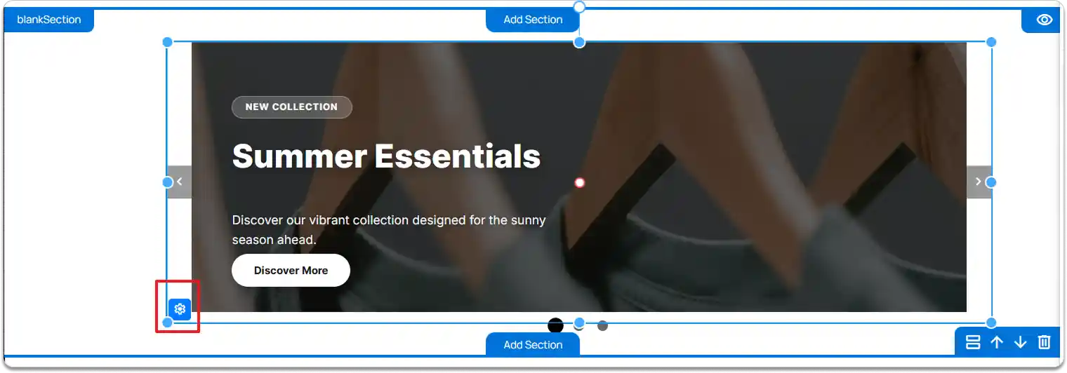
Click the Content Rotator element and select the Settings icon to open the Slide Editor for managing slides.
Editing Slide Content in Carousel Elements
-
Add & Arrange Elements
-
Drag and drop basic elements onto the slide (text, images, buttons, etc.).
-
Click on an element to modify.
-
-
Layer Management
If an element overlaps or hides another:
-
Right-click the element.
-
Select Move Forward **or **Move Backward.
-
This ensures text or images appear clearly on top.
-
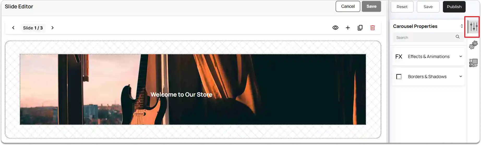
Carousel Properties
-
Select the Carousel element.
-
Go to the Right Tools Panel and click on Properties.
-
Under Effects & Animations, choose the desired visual effect and animation action.
-
Under Borders & Shadows, enable Box Shadow if needed and adjust the margin and padding to control spacing.
-
To remove the Carousel element, click the Delete Element button.
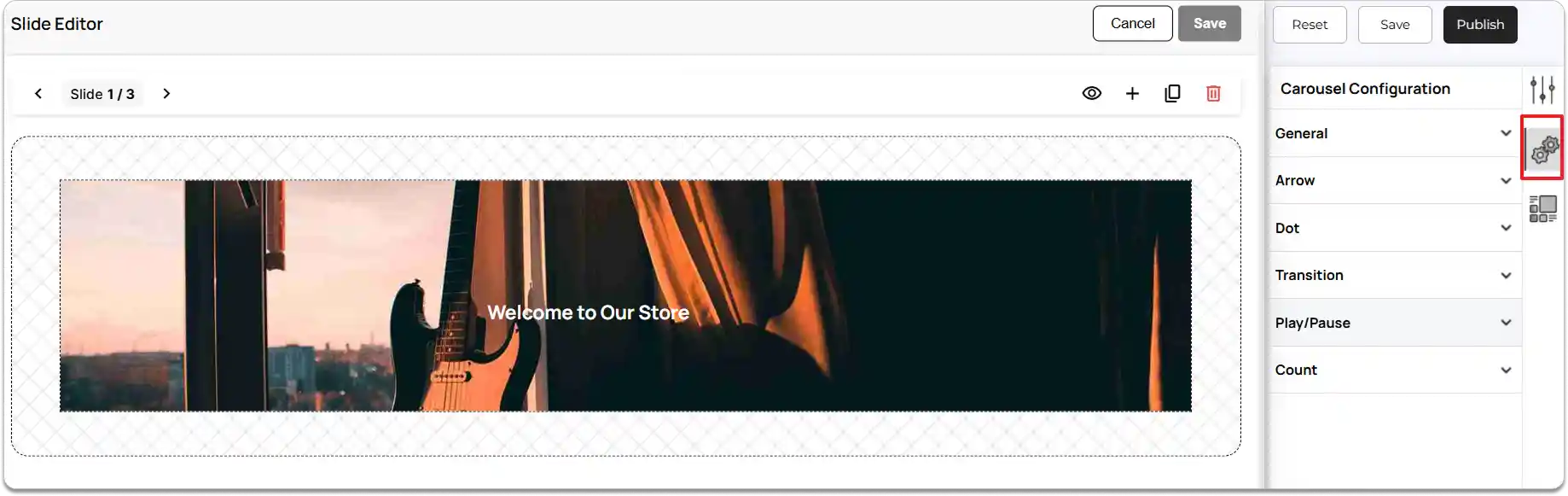
Carousel Configuration
-
In the Right Tools Panel, click on the Carousel Configuration option.
-
Under the General settings, choose how the carousel should behave.
-
Manual carousel: Users can navigate through slides using arrows or indicators. No automatic sliding will occur.
-
With seconds: Slides will rotate automatically based on the time interval you set.
-
Time Interval: When ‘With seconds’ is selected, set the Time Interval (in seconds) for slide rotation.
-
Enable Pause on Hover if you want the carousel to stop sliding when the user places the cursor over it.
-
Under Arrow, enable Show arrow to display and edit the carousel arrows.
-
In Arrow design, choose from the available styles: Chevron, Arrow, Simple arrow, Line arrow, or Circle arrow.
-
Customize arrow appearance using:
-
Arrow color
-
Arrow hover color
-
Arrow outer design
-
-
Enable Show arrow background color to configure:
-
Arrow background color
-
Arrow hover background color
-
Arrow padding left right
-
Arrow padding top bottom
-
Arrow type
-
-
Enable Show arrow inside to adjust:
-
Arrow top position
-
Arrow left position
-
-
Enable Center arrow in container to automatically center the arrows within the carousel area. (When this option is turned on, the carousel will center the arrows based on the main container area and ignore the dot area if the dots are placed outside the carousel.)
-
Arrow Spacing: You can choose a spacing style—Space evenly, Space between, or Space around—to control how the arrows are positioned within the carousel area.
-
Enable Show arrow on hover to display arrows only when the user hovers over the carousel.
-
Next Dot settings.
-
Enable Show dot to display navigation dots for the Carousel.
-
Choose a Dot type such as Dot, Number, or Number with progress bar.
-
Select the Dot position.
-
Set the Dot alignment based on your layout needs.
-
Adjust the Dot count if you want to limit how many dots are displayed.
-
Choose where the Show Active Dot In should appear (Center, Start, End).
-
Set the Dot gap to increase or decrease spacing between dots.
-
Customize Dot width and Dot height to define the dot size.
-
Set Dot color, Dot border radius, Dot border color, and Dot border width.
Active Dot Settings
-
Customize Active dot height, Active dot color, Active dot border radius, Active dot border color, and Active dot border width to highlight the active slide indicator.
-
Enable Scale active dot if you want the active dot to appear larger or animated for better visibility.
Around Dot Styling
-
Adjust Around dot padding to control spacing around individual dots.
-
Set Around dot border radius to define the shape around each dot.
-
Go to the Transition settings to control how your Carousel slides move from one slide to another.
-
Choose Transition type.
-
Select a Transition type from the following options:
-
Default
-
Slide
-
Flip
-
Flip Fade out fade in
-
-
If you choose Slide.
-
Enable Infinite scroll if you want the slides to loop continuously.
-
After enabling Infinite scroll, choose a Slide Transition Direction.
-
Choose a **Slide out style **to decide how the current slide exits before the next slide appears.
-
Enable Loop slides if you want the slides to restart from the first slide after reaching the last.
-
Set a Slide smooth transition duration to define how smoothly and quickly the slide animation should play.
-
If you choose Flip.
-
Choose a Flip direction.
-
If you choose Flip Fade out fade in.
-
Set the Fade animation duration to control how long the fade-out and fade-in effects take.
-
Next Play/Pause.
-
Enable the Show play and pause button option to display the Play/Pause controls on the Carousel.
-
Set the following properties as needed:
-
Play and pause button top position.
-
Play and pause button left position.
-
Play and pause button color.
-
Play and pause button background color.
-
Play and pause button hover background color.
-
Play and pause button hover color.
-
-
Under Count settings, enable the Show count option to display the current slide number.
-
Set the following positioning options:
-
Count top position
-
Count left position
-
-
Enable the Show total count option if you want to display both the current slide number and the total number of slides.
-
Configure the visual appearance:
-
Count color
-
Total count color
-
Count background color
-
-
Adjust spacing and sizing:
-
Count padding top bottom
-
Count padding left right
-
Count border radius
-
Count font size
-
You can also use a Slider element to create a carousel on your website.
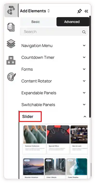
To add this
-
Go to the Left Tools Panel and click Add Elements.
-
Under Advanced Elements, scroll down or search for any Slider elements.
-
Drag and drop the Slider into your desired section or layout area.
-
To learn more about adding and customizing the Slider elements,
.