
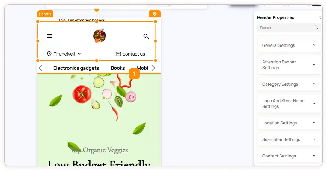
Header Customization
The Header in ZenBasket Builder is fully editable, allowing you to tailor both its appearance and functionality to fit your store’s branding. Whether you want to highlight important announcements, refine your navigation, or control the visibility of elements like logo, search, login, wishlist, and cart - the editor provides complete flexibility. The following sections explain how to access the header panel and configure each available setting.
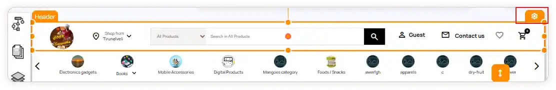
How to Access Header Settings
-
Hover over the header section.
-
Click the Settings icon.
-
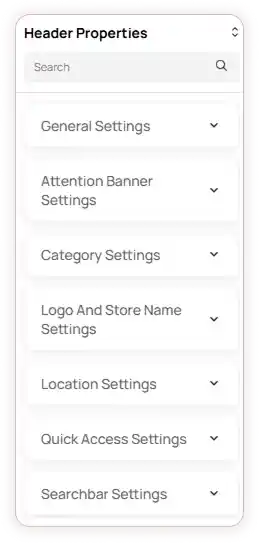
The Header Properties panel will appear on the right.
-
Use the Search bar to quickly locate specific properties.
Header Settings Overview
The header settings panel includes the following configuration options:
1. General Settings
Start by selecting the overall look of your header.
Choose from Classic, Rounded, or Professional layouts depending on your store’s style.
2. Attention Banner
If you want to display announcements (sales, offers, shipping info, etc.) above the header:
-
Turn on the Attention Banner toggle.
-
Customize the banner background and text color for visibility and branding.
3. Category Settings
This option displays your product categories right inside the header for easy navigation.
-
Enable or disable category visibility based on your store’s requirements.
-
Select the Menu Type that fits your store layout -Default or Image Category.
-
When the Default menu type is selected, the menu will include quick access options along with category options.
-
When the Image Category menu type is selected, you can configure its settings by clicking the Configuration icon:
-
General Settings – Select the menu type and design type.
-
Color Settings – Customize text colors (normal, hover, and active), arrow color, and underline color for the menu.
-
Content Settings – To add a menu item, click Add Main Menu, enter the menu name, and choose the link type from the dropdown. Submenu items can be added in the same way.
-
You can edit or delete menu items anytime using the respective icons.
4. Logo & Store Name
This controls how your brand appears in the header.
-
Show or hide the logo.
-
Adjust the logo background and store name color for the best contrast and branding.
5. Location
If your store offers multiple locations, you can show them directly in the header:
-
Enable or disable the location details.
-
Customize the icon and text colors.
6. Quick Access
Useful for highlighting shortcuts such as Deals, Product, Offers, etc.
-
Turn on Quick Access.
-
Adjust the text color so it stands out in the header.
7. Search Bar
The Search Bar is one of the most frequently used elements on an ecommerce website, so ZenBasket Builder allows you to style every detail for better usability and conversions.
You can modify the following properties:
-
Category Background Color
-
Category Color
-
Search Bar Background Color
-
Search Bar Text Color
-
Search Button Background Color
-
Search Button Color
8. Login
-
Enable or disable the login option based on your store’s needs.
-
Personalize the icon and text color to match the theme.
9. Contact
-
Enable the Contact Visibility toggle to display contact us element in the header.
-
You can customize: Contact Icon Color and Contact Text Color
10. Wishlist
Give shoppers quick access to their saved items.
-
Enable or disable Wishlist visibility.
-
Customize the wishlist icon color.
11. Cart
The cart icon is one of the most important elements for conversions.
-
Enable or disable the Cart icon based on your preference.
-
Customize the cart icon color, cart count background color, and cart count text color to match your theme.
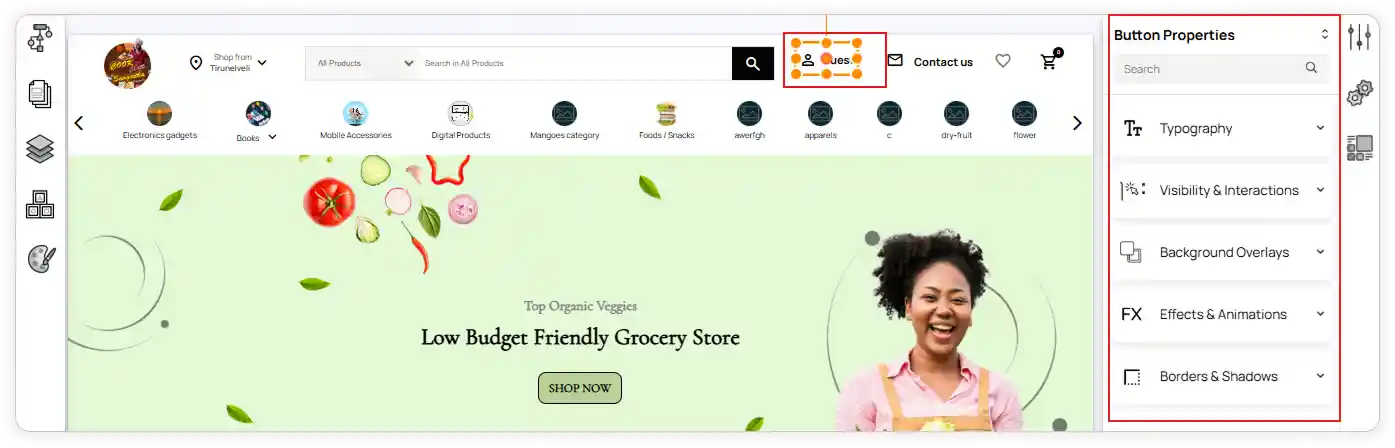
Editing Each Header Element Individually
Once the main header settings are adjusted, you can click any individual element to style it in detail.
For example, selecting the Login button will give you access to:
-
Typography
-
Visibility & Interactions
-
Background overlays
-
Effects & animations
-
Borders & shadows
Even the inner parts of the element — like text or icon — can be edited independently.
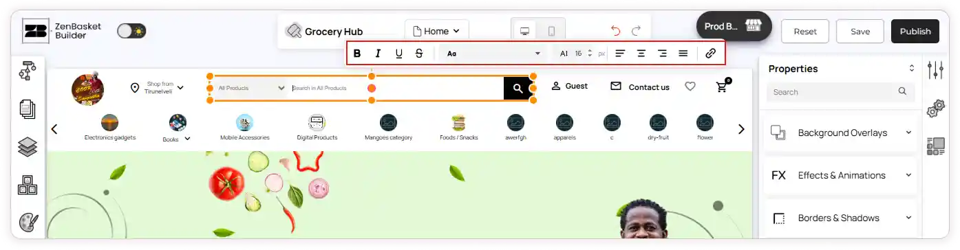
Quick Edit & Adding New Elements
-
Quick Edit allows you to make fast changes without browsing through every panel.
-
If you want to add something new to the header:
-
Open the Add Element panel from the left sidebar.
-
Drag any component (button, icon, menu, image, etc.)
-
Drop it directly inside the header.
Mobile View – Header Settings
The mobile header includes most of the same customization options available in the web view, with a few differences optimized for smaller screens.
In Mobile View, you can configure the following settings under Header Properties:
-
General Settings
-
Attention Banner Settings
-
Category Settings
-
Logo & Store Name Settings
-
Location Settings
-
Search Bar Settings
-
Contact Settings
-
Cart Settings
Note: Quick Access, Login, and Wishlist are enabled by default in mobile view. These options do not appear in the main header settings list and can be customized separately.
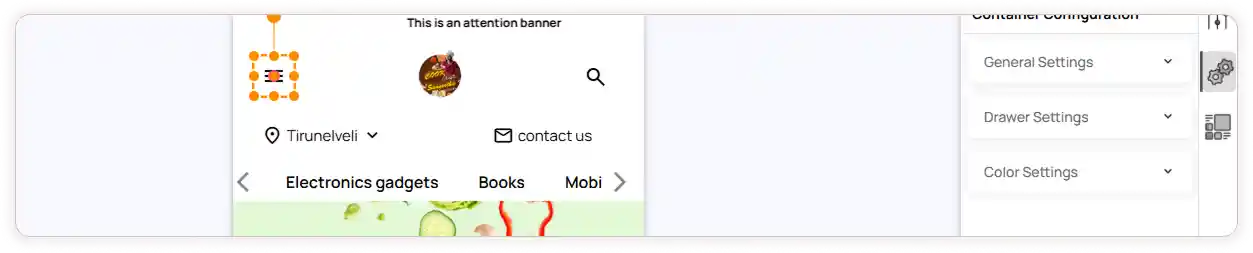
Quick Access Settings (Hamburger Menu)
Click the Quick Access (hamburger icon) in the header. The configuration panel will appear on the right side.
Available configurations include:
-
General Settings – Select the Menu Type (Horizontal or Hamburger), choose the Design Type, set Menu Position, and choose Menu Mode
-
Drawer Settings – Enter the Drawer Title, set Drawer Width, and enable/disable the Backdrop and Close Icon
-
Color Settings – Configure Normal Text Color, Hover Text Color, Active Text Color, and Arrow Icon Color
-
Content Settings – Click Add Main Menu to create menu items. Enter the menu item name and select the Link Type. Add submenus if required. Edit or delete menu items anytime using the respective icons
Login Settings
-
Enable or disable Login visibility based on your store requirements.
-
Customize the text color to match your store theme.
Wishlist Settings
-
Enable or disable Wishlist visibility.
-
Customize the Wishlist icon color as needed.