Slider Element
Introduction
Sliders are rotating content blocks used to display multiple images, products, or promotional messages in a single space. In an online store, they help highlight offers, showcase products, and improve visual engagement without crowding the page.
ZenBasket Builder supports two slider categories: Static Sliders and Dynamic Sliders, each offering different editing and design behaviors.
Types of Sliders
Static Sliders
Static sliders allow manual customization. You can edit content, add elements, and control the layout depending on the slider type.
You can drag and drop any basic elements into static sliders.
Types of Static Slider
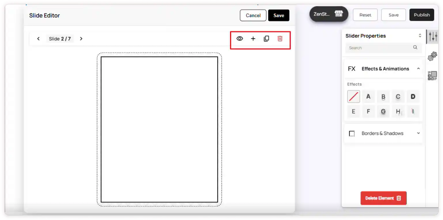
1. Individual Slider
Use this slider type when you want full control over each slide.
What you can do:
-
Edit each slide’s content and elements separately.
-
Add new slides with unique designs.
-
Borders and backgrounds remain consistent across all slides.
-
Hide individual slides without affecting others.
When to use:
Choose this option when every slide needs its own custom design.
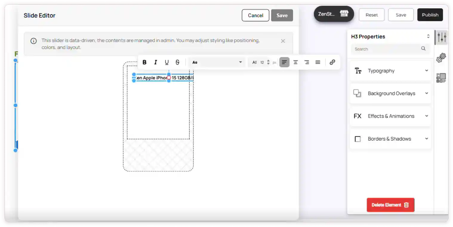
Slide-Editor Actions
-
Hide slide: Click the Eye icon to temporarily hide a slide from the storefront. The slide will remain in the editor for future use.
-
Duplicate slide: Click the Duplicate icon to create an exact copy of the selected slide. This is useful for keeping consistent layouts or creating quick variations.
-
Delete slide: Click the Delete icon to permanently remove the slide from the slider.
-
Add slide: Click the Add icon to create a new blank slide that you can design from scratch.
-
Save or cancel: Click Save to apply your changes, or Cancel to discard them.
2. Unified Slider
In this slider type, element layouts are shared across all slides.
Behavior:
-
Any design or element-level change is reflected across every slide.
-
You can edit text and content individually for each slide.
-
Add Slide option is not available.
-
You can only hide or duplicate slides.
-
Hiding or deleting elements affects the entire slide pattern.
When to use:
Use this when you want one consistent design repeated across all slides.
Slide-editor actions:
-
Hide slide: Click the Eye icon to temporarily hide a slide from the storefront. The slide remains in the editor for future use. Hiding an element inside one slide will hide the same element across all slides.
-
Duplicate slide: Click the Duplicate icon to create an exact copy of the selected slide. This is useful for maintaining consistent layouts or creating quick variations.
-
Delete slide: Click the Delete icon to permanently remove the slide from the slider. If you delete any element inside one slide, the deletion will be reflected across all slides.
-
Click Save to apply your changes or Cancel to discard them.
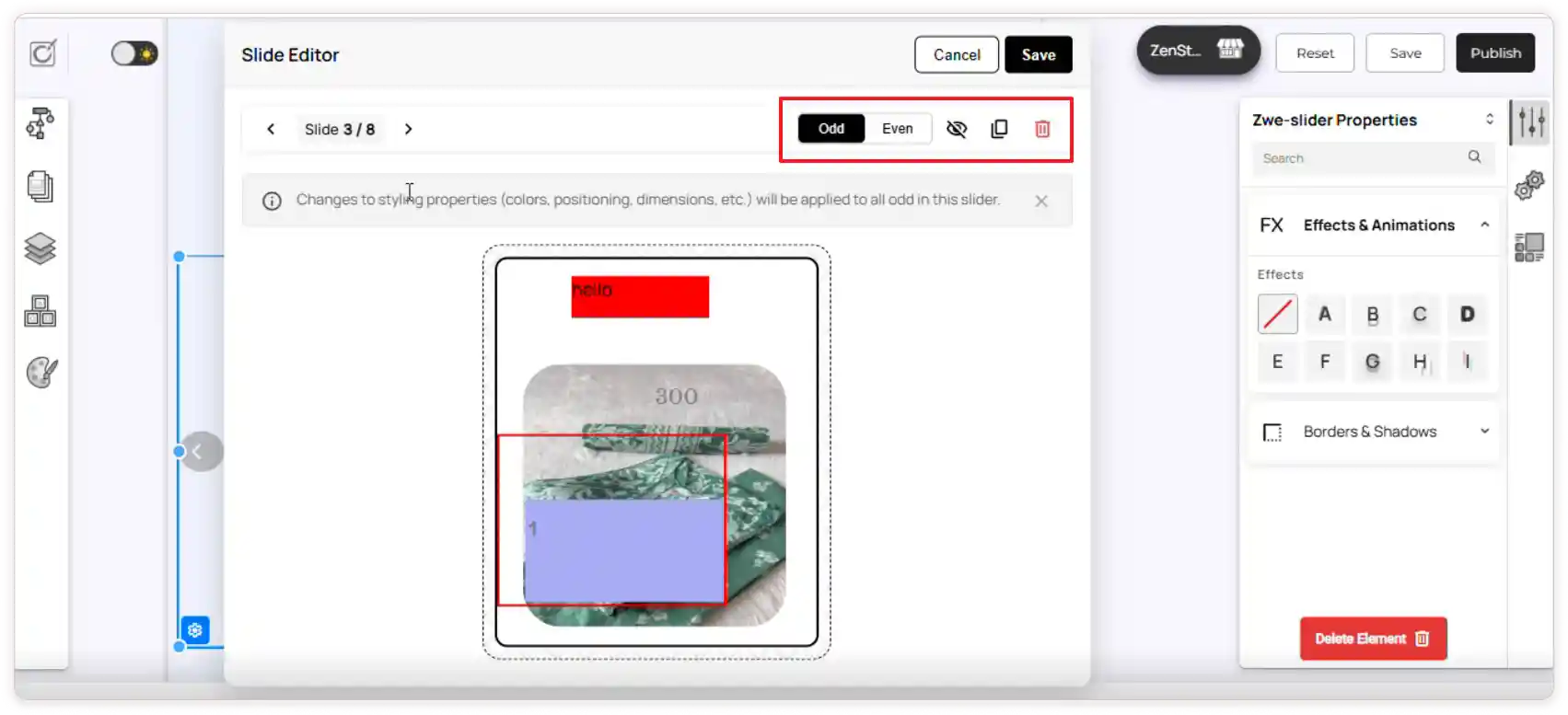
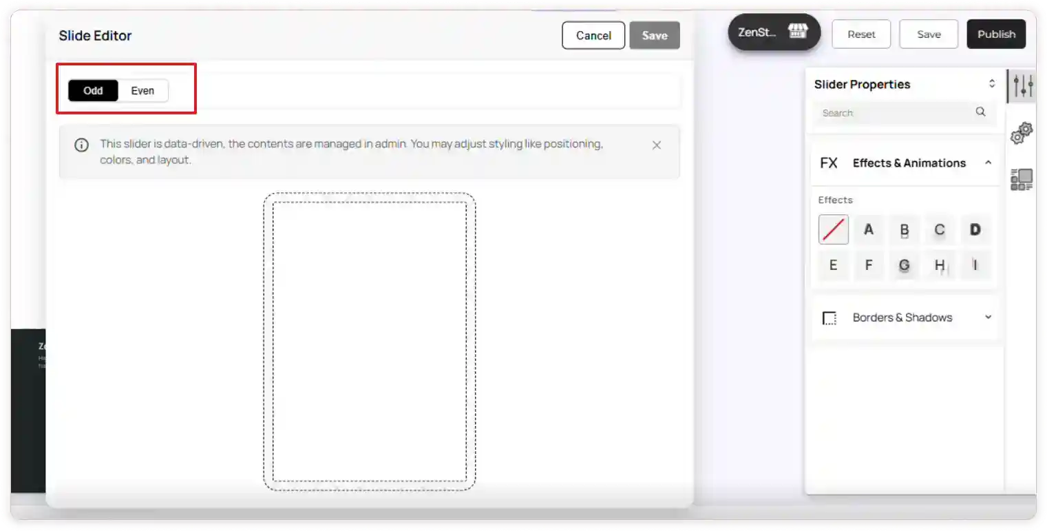
3. Odd & Even Slider
This slider type applies changes to alternating layouts using Odd and Even card patterns.
Behavior:
-
Odd cards: 1, 3, 5…
-
Even cards: 2, 4, 6…
-
Text/content can be edited individually.
-
Element positions and structure remain identical for all Odd or all Even cards.
When to use:
Ideal for creating alternating layouts (like zig-zag or two-patterned designs).
Slide-editor actions:
-
Hide slide: Click the Eye icon to temporarily hide the selected slide and its next slide from the storefront. Both slides remain available in the editor for future use.
-
Duplicate slide: Click the Duplicate icon to create exact copies of the selected slide and the next slide. This helps maintain consistent layouts or quickly create alternating patterns.
-
Delete slide: Click the Delete icon to permanently remove the selected slide and its next slide from the slider.
-
Save or cancel: Click Save to apply your changes or **Cancel to discard them.
Dynamic Sliders
Dynamic Sliders automatically pull content from your store using Data Mapping, so basic elements cannot be added to these slides, as options will be disabled.
Types of Dynamic Slider
1. Unified Slider
Behavior:
-
You cannot drag and drop basic elements inside dynamic sliders.
-
Any design or element-level change is reflected across every slide.
-
All elements inside the slider must be enabled through Data Mapping.
-
Only the fields you select will be displayed.
You can:
-
Reposition mapped fields.
-
Adjust layout properties.
When to use:
Perfect for product carousels that update automatically based on store data.
Slide-editor actions:
You can edit any field that has been enabled in Data Mapping within the Slide Editor.
2. Odd & Even Slider
Supports the same alternating pattern as static sliders.
Behavior:
-
Element structure stays identical within each card groups.
-
Text/content is pulled from data mapping.
When to use:
Use this for dynamic product sliders with alternating layout patterns.
Slide-editor actions:
How to Add a Slider Element
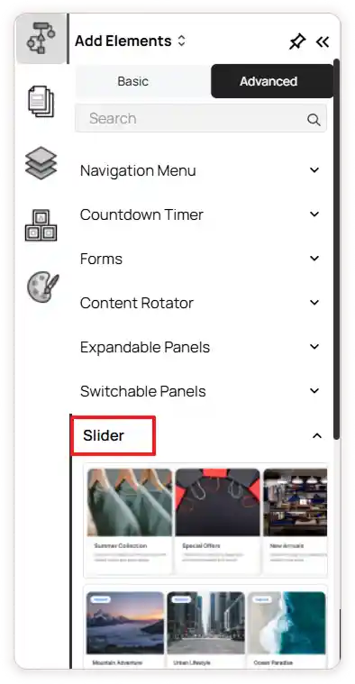
-
Go to the Left Tools Panel and click Add Elements.
-
Under Advanced Elements, scroll down or search for the Slider element.
-
Drag and drop the desired slider into your desired section or layout area.
-
Adjust the slider’s position and size using the drag handles as needed.
-
Click the Slider element and select the Settings icon to open the Slide Editor for managing slides.
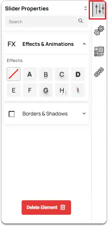
Slider Properties
-
Select the Slider element.
-
Go to the Right Tools Panel and click on Properties.
-
Under Effects & Animations, choose the desired visual effect.
-
Under Borders & Shadows, enable and set Box Shadow if needed and adjust the margin and padding to control spacing.
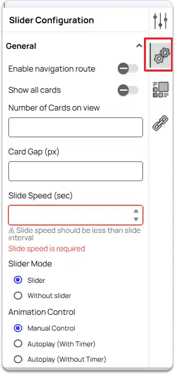
Slider Configuration
In the Right Tools Panel, click on the Slider Configuration option.
Under General settings,
-
Enable navigation route
Turn this on if you want the entire slider to act as a clickable navigation.Note: If a button element with navigation exists inside the slide, this option will not appear. Delete the button and save your changes—this setting will then reappear (disabled by default), and you can enable it to apply navigation to the whole slider.
-
Enable Show all cards
Allows the slider to display all cards in the slider. -
Set Number of Cards on view
When Show All Cards is enabled: Enter the number of cards you want to display at once.
When disabled: If left this empty. The number of visible cards will automatically adapt based on screen width.
-
Card Gap
Sets the spacing between each card. -
Slide Speed
Adjusts how fast each slide transition occurs. -
Slider Mode
Choose how the slider behaves:
-
Slider
Slides move when users click the navigation arrows. -
Without Slider
Cards wrap naturally like a list.
Then select a Navigation Style.
-
-
Animation Control
Select how the slider animates:
-
Manual Control
Slides move based on clicking. Choose your preferred Navigation Style. -
Autoplay (With Timer)
Slides move automatically at set intervals. Configure: Autoplay Interval -
Autoplay (Without Timer)
Slides move continuously. Set: Slide Speed
-
-
Enable Circular Slide
Allows the slider to loop endlessly. -
Or Enable Display Dots Navigation and choose the Dots Position.
-
Enable Pause on Hover to pause the carousel when the user hovers over it.
-
Set the Slide Direction to either To Right or To Left.
-
Slide Unit
Choose how each slide moves:
-
Card
Moves by the width of a single card. -
Slider
Moves by the full width of the slider.
-
-
Scroll Behavior
Set how the slider reacts to scrolling.
-
Arrow Style
Select the design of navigation arrows.
-
Arrow Placement
Choose where the arrows should appear within the slider layout.
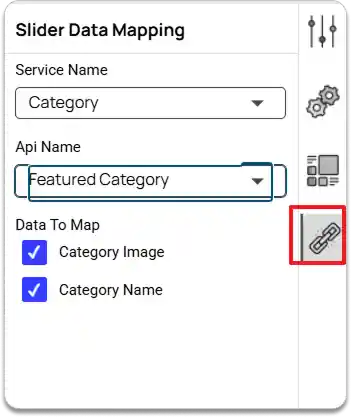
Slider Data Mapping
The Slider Data Mapping option is available only for Dynamic Sliders. Since you cannot drag and drop elements into dynamic slider cards, this feature allows you to populate card content using data from your services.
-
In the Right Tools Panel, click Slider Data Mapping.
-
Choose a Service Name.
Select the service from which you want to pull data: Products, Categories, Testimonials, Brands, Blogs, Deals, or Locations. -
Choose an API Name.
Pick the API associated with the selected service. -
Select the data fields.
From the chosen API, select the data fields you want to map into the slider cards.
Once mapped, the selected data will automatically appear inside each card of the dynamic slider. You can reposition and edit them.