Introduction to Color Theme Palette
Creating a color theme is an essential part of website design. A well-chosen color palette ensures consistency across your website, making it look professional, cohesive, and visually engaging. By carefully selecting primary, secondary, and accent colors, you can guide user attention, highlight important elements, and create a memorable user experience.
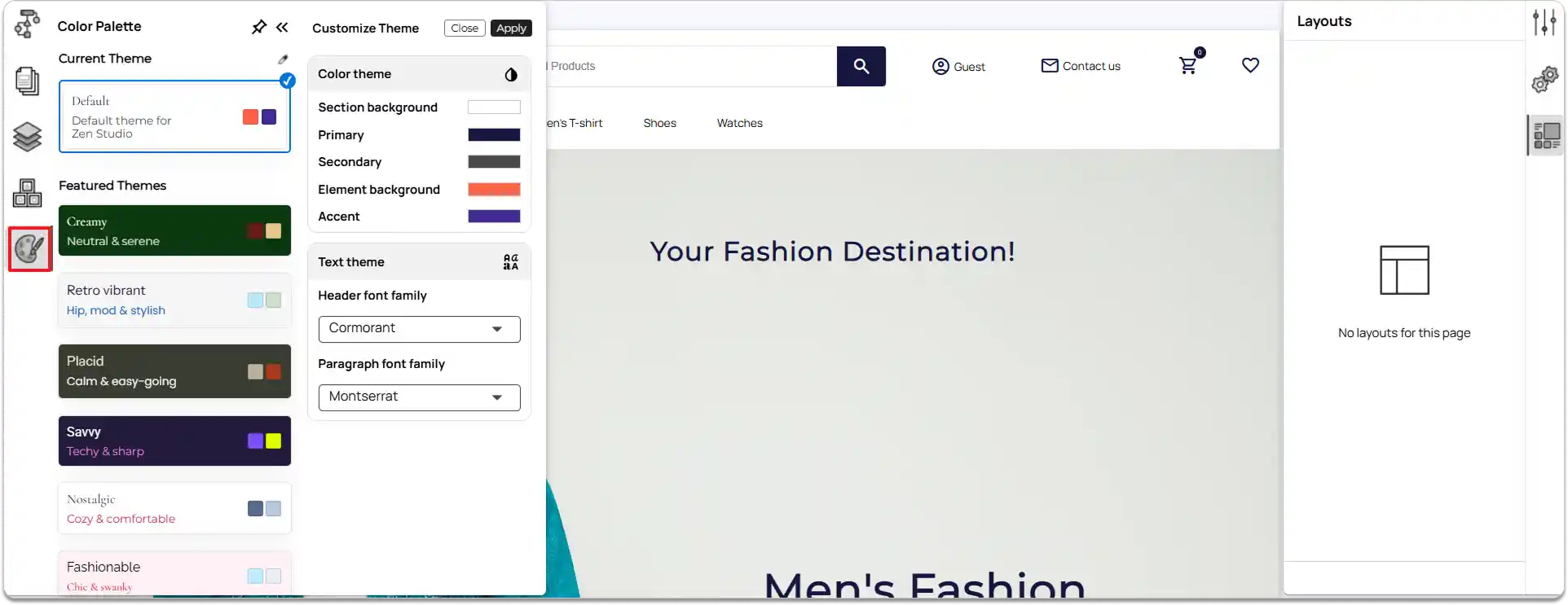
Section Background: The main background color for each section of your page.
Defines the overall tone and visual separation between sections.
Primary Colors: The main colors used for key interactive elements and highlights. Represents your brand’s identity and guides user attention.
Secondary Colors: Supporting colors that complement the primary palette. Add balance, contrast, and visual harmony to the design.
Element Backgrounds: Colors applied to specific elements. Helps highlight content areas and create a visual structure.
Accent Colors: Bright or contrasting colors used sparingly across the site. Emphasize important details, actions, or alerts and add vibrancy.
Customizing the Site Theme
Any changes you make in the Color Palette are applied globally across your entire site.
Note: Changes to the color palette will not affect sections or elements that have custom colors applied.
-
Access the color palette
- In the left tools panel, click on the Color Palette option.
-
View current and featured themes
-
At the top, you will see the current theme applied to your site.
-
Below, you can browse Featured Themes available in ZenBasket Builder.
-
-
Apply a theme.
-
Click on a theme you like from the list.
-
Click Apply to set it as your site’s theme.
-
-
Customize colors
-
Click the color picker icon to start customizing your theme.
-
You can adjust:
-
Section Background
-
Primary Colors
-
Secondary Colors
-
Element Backgrounds
-
Accent Colors
-
-
Set text theme
Choose the Header font family and Paragraph font family to match your design style.