
Tab Element
Tabs help display related content in a structured way, letting users switch between sections easily without scrolling.
In ZenBasket Builder, use the Tab element to organize information neatly within a single section for a clean and user-friendly layout.
Adding the Tab Element
To add the Tab element to your layout:
-
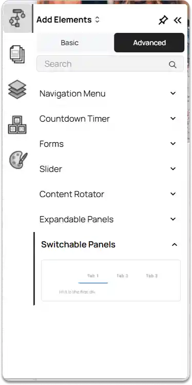
Go to the left tools panel and click Add Element.
-
Under Advanced elements, find the Switchable Panels element.
-
Click and drag the Tab element into your layout and drop it in the desired position.
By default, the Tab element extends across the full width of the section. You can drag and resize the Tab element as needed and reposition it anywhere within your layout.
Customizing the Tab Element
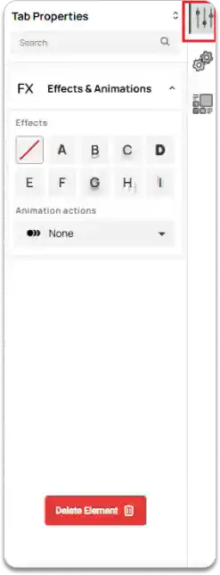
On the right tools panel, click Properties.
-
Under Effects & Animations, set the desired Effect and choose an Animation action for the Tab element.
-
To remove the Tab element, click the Delete Element button.
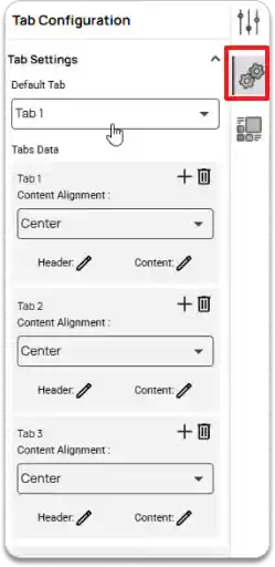
Click on the Configuration option.
Under Tab Settings, you can:
-
Set the Default Tab to decide which tab appears first when the page loads.
-
Manage Tabs Data, where you can adjust the Content Alignment, edit the Header and Content
-
Use the Add icon and Delete icon to add or remove tabs as needed.
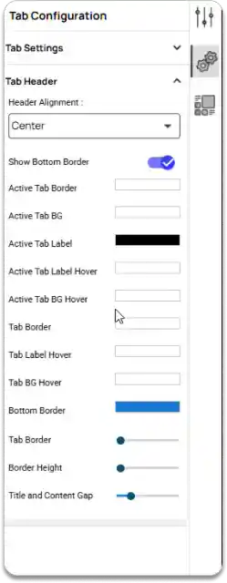
Under the Tab Header section, you can adjust the appearance and alignment of your tabs.
-
Set the Header Alignment.
-
Enable or disable the Bottom Border.
-
Customize colors for the Active Tab Border, Active Tab BG, Active Tab Label, Active Tab Label Hover, Active Tab BG Hover, Tab Border, Tab Label Hover, Tab BG Hover, Bottom Border.
-
Adjust Tab Border, Border Height, and Title and Content Gap to control spacing and layout.
FAQ
How can I switch between tab items? ▼
Click on a tab header to view its content.
Is it possible to resize individual tabs? ▼
No, individual tab sizes can’t be adjusted separately.
What does the default tab mean? ▼
The default tab is the first one shown when the page loads.