
Search Bar Customization
The Search Bar Customization feature in ZenBasket allows you to modify the appearance and behavior of the search bar to match your store design and improve the customer search experience.
How to customize the Search Bar
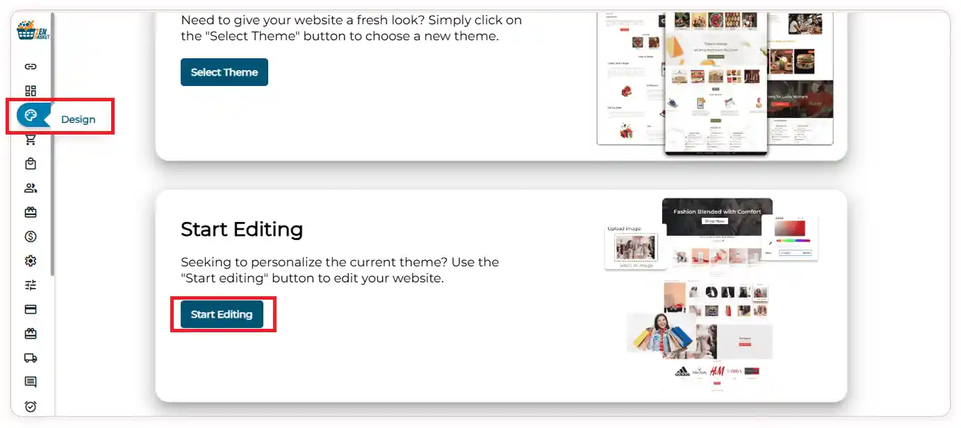
- Log in to your ZenBasket Store Admin.
- Navigate to the Design module.
-
Click Start Editing to open the ZenBasket Builder.
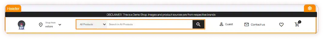
- In the builder, select the Search Bar section.
-
Click the Settings icon.
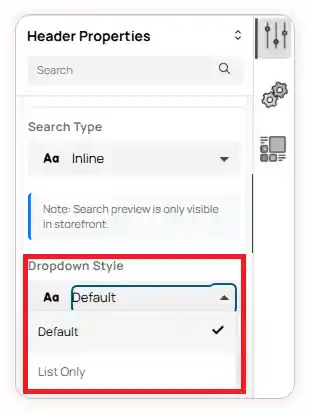
- The Header Properties window will open.
-
Click the Search Bar Settings dropdown to view the available customization options.
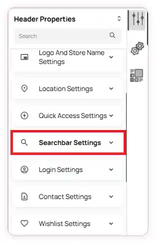
- In the Search Bar Settings, you can customize how the search feature appears and behaves on your storefront.
-
First, choose the Search Type based on your preferred search layout.
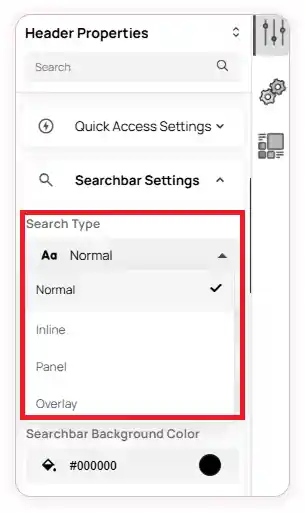
- The available options include:
-
Normal – Displays the search bar with standard search functionality.
-
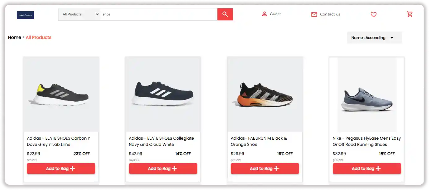
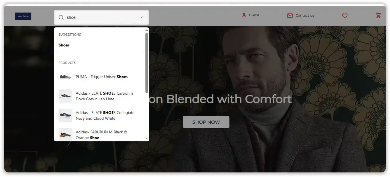
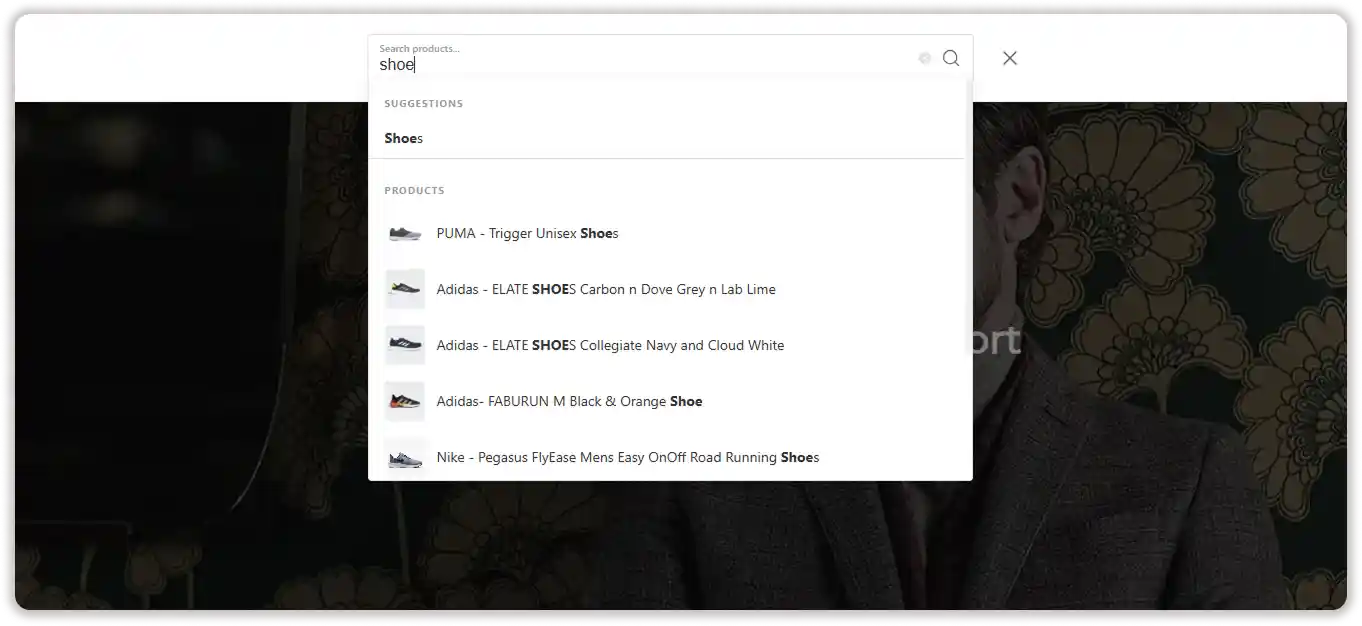
Inline – Displays search results in a dropdown below the search bar.
 If you select Inline as the search type, you’ll have additional options available.
You can choose:
If you select Inline as the search type, you’ll have additional options available.
You can choose:- Default – Displays product names along with their images in the search results.
- List Only – Displays only the product names.
-
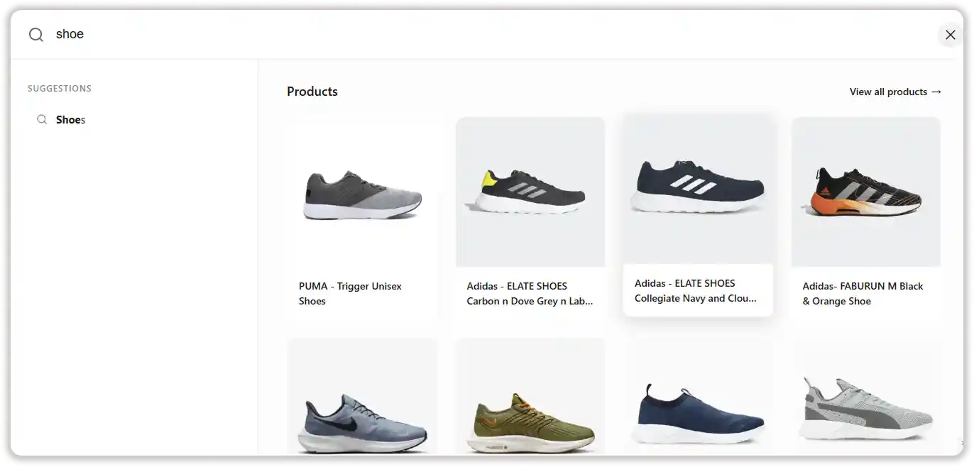
Panel – Opens the search results in a side panel, and the results will appear on the right side of the screen.
-
Overlay – Displays the search interface as a full-page overlay.
 11. You can further customize the search behavior by configuring the following settings: Placeholder Text, Search Debounce Delay (which controls how quickly the search starts.), Minimum Characters to Search, Result Limit, and Border Radius.
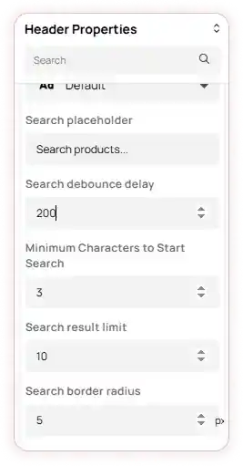
-
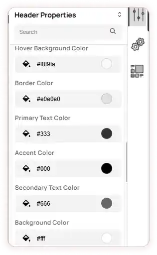
You can also change the appearance of the search bar using the Color Picker.
-
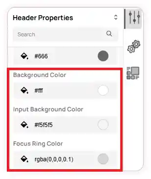
The available color options include Hover Background, Border Primary, Secondary Text, Accent, Background, Input Background, and Focus Ring.
Note: You can set the Focus Ring color only when the Inline search type is selected.
Note: The preview of these customizations can only be viewed on your storefront.